In today's fast-paced world, businesses rely on information and data to make informed decisions and improve their overall efficiency.
But, it can be challenging to collect and organize data efficiently to extract valuable insights. Many businesses face the problem of fragmented information across different systems, making it challenging for teams to connect the dots and make sense of it all. In fact, 65% of respondents to a recent Quickbase survey said using multiple project management software solutions prohibit them from easily sharing project-related information with others.
Effective data entry ensures that reports and analytics generated from the data are reliable and can be used to make informed decisions. Quickbase's new form experience will allow you to easily create forms with drag-and-drop, customize how your forms function, and create the perfect data-entry experience for your users - and it will all be made even smoother with clean data entry best practices.
In this blog post, we will discuss three key tips and techniques to improve your data entry game and enhance productivity in the workplace.
- Clarity and conciseness: be explicit with what you're asking of your users
- Efficiency: increase productivity by ensuring you're collecting the most important information
- Data accuracy: make decisions with confidence knowing that your data is accurate
Let’s take a look at these core principles and outline techniques you can employ to keep your users focused and productive.
Clarity and conciseness
Being clear and concise in the forms you create will prevent confusion and limit mistakes that users may make when entering data. Keep the following techniques in mind when building forms.
Use simple language and clear form fields
Using simple language in form fields ensures that they're readily understood by your users. Labeling the fields clearly and placing them in a logical order can help to minimize confusion and frustration for users.
Not all users may be familiar with technical jargon, so using plain language can make the process smoother for everyone. This is important when the fields in your database have technical terminology intended for database administrators and software developers to understand.
Include helpful hints or tooltips
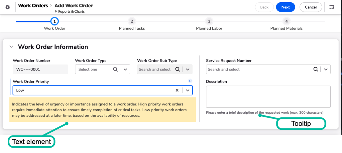
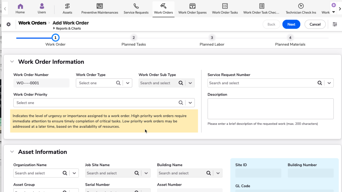
Tooltips and text elements can provide important context when your users are interacting with your form. By using these tools effectively, you can help guide your users through the form completion process and reduce the likelihood of errors or confusion.
It's important to strike a balance between providing too much information (which can be overwhelming) and too little (which can lead to confusion or errors). In general, try to keep your tooltips and hint text concise and focused, providing only the most essential information.

Use visual cues
Assist your users in navigating your form by providing visual cues. This technique can help emphasize crucial parts of the form and ensure that they are completing essential fields. There are a few ways you can accomplish this. Using color helps draw your users attention to certain areas. It’s important to use color sparingly as too many different colors can confuse and distract your users.
When appropriate, show your users messages on the form, especially when the inputs would bend your business process. Dynamic messages are a great way to communicate with your users.

Efficiency
Keeping efficiency in mind can help increase both the quality and quantity of data you capture with forms. By designing forms that are easy to fill out and navigate, you can streamline the data collection process and reduce potential errors.
Use default values
Use default values to reduce the number of fields a user has to complete. Use values that are applicable to the vast majority of cases your users will encounter, and give them an option to update them if necessary. For example, if activities are normally created for encounters with customers on the same day, but occasionally your reps need to book meetings a few weeks into the future. By defaulting the Activity Date to the current date, you save valuable time.
Limit unnecessary fields
Being efficient sometimes requires you to focus only on what’s most important. To help prevent confusion and cut down on fatigue, ensure your users are only filling out what’s most important. For example, a safety officer only needs to complete a root cause analysis for failed inspections. Use conditional logic to show that section or page when the Status changes to Failed. This saves time and help prevent frustration for users who feel they are being asked to fill in redundant or unnecessary fields.
Provide progress indicators
Progress indications can help reduce user fatigue and improve overall user experience. This is especially true when dealing with larger forms or complex tasks that take longer to complete. Progress bar indicators can help alleviate this frustration by keeping users informed about the status of the task and estimate the time remaining.
Progress bars can also be used as a navigational aid for users. If a user has started working on a longer intake form, progress bars can provide a visual cue to let them know that they can go back to review earlier entries. Additionally, users can get a preview of what other types of information they will be asked to complete when the steps within the formed are named specifically.

Data accuracy
In order to make good decisions, you need accurate data. Consider these techniques to help your users fill in data correctly and get ahead of any issues that may arise once your form goes live.
Use validation
Many form tools allow for validation on data-input type. This ensures that information like email addresses and phone numbers are formatted correctly. Where possible, use validation based on your business process logic to ensure users are inputting the correct data. For example if your process requires that same-day site deliveries arrive after 4PM, you can show a message to a user to inform them of that policy if they attempt to schedule the delivery earlier.
Test the form with real users
Testing your form with users before releasing it is a great way to uncover issues in your workflow. This allows you to identify any areas of confusion or frustration that users may encounter. By watching users interact with your form, you can a better understanding of how they approach the task, where they get stuck or make mistakes, and what they find intuitive or confusing.
You can conduct user testing in a number of ways, depending on your resources and needs. You might opt for a simple, informal test with a few colleagues, or you might invest in a more rigorous, structured testing process with a variety of participants. Whatever approach you choose, the key is to gather feedback from a diverse group of users to get a broad range of perspectives.
Conclusion
Getting accurate data efficiently from your end users takes planning and foresight. This approach will help you avoid common pitfalls that result in disgruntled users – or worse, unreliable data. If you need more help, consider using Quickbase to collect data and bring order to the chaos. As a the first platform specifically designed for dynamic work, Quickbase is purpose-built to unite your data and make it easily accessible and understandable across your organization.


